This semester–long project of making a new identity for University Hospitals included creating a new mark, and integrating that mark into official communication pieces and an event sponsored by the hospital. The process of putting everything together required much attention to detail and focus, but created the beginnings of a cohesive brand.
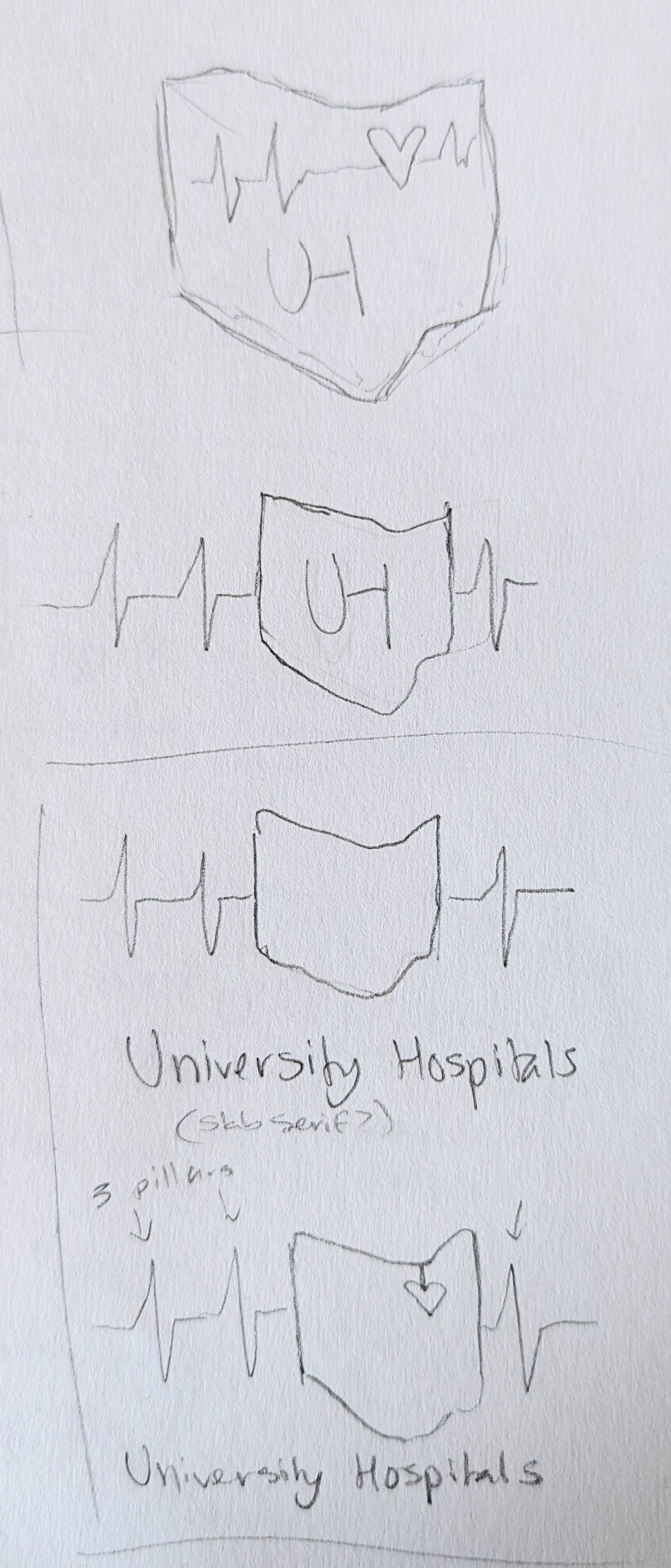
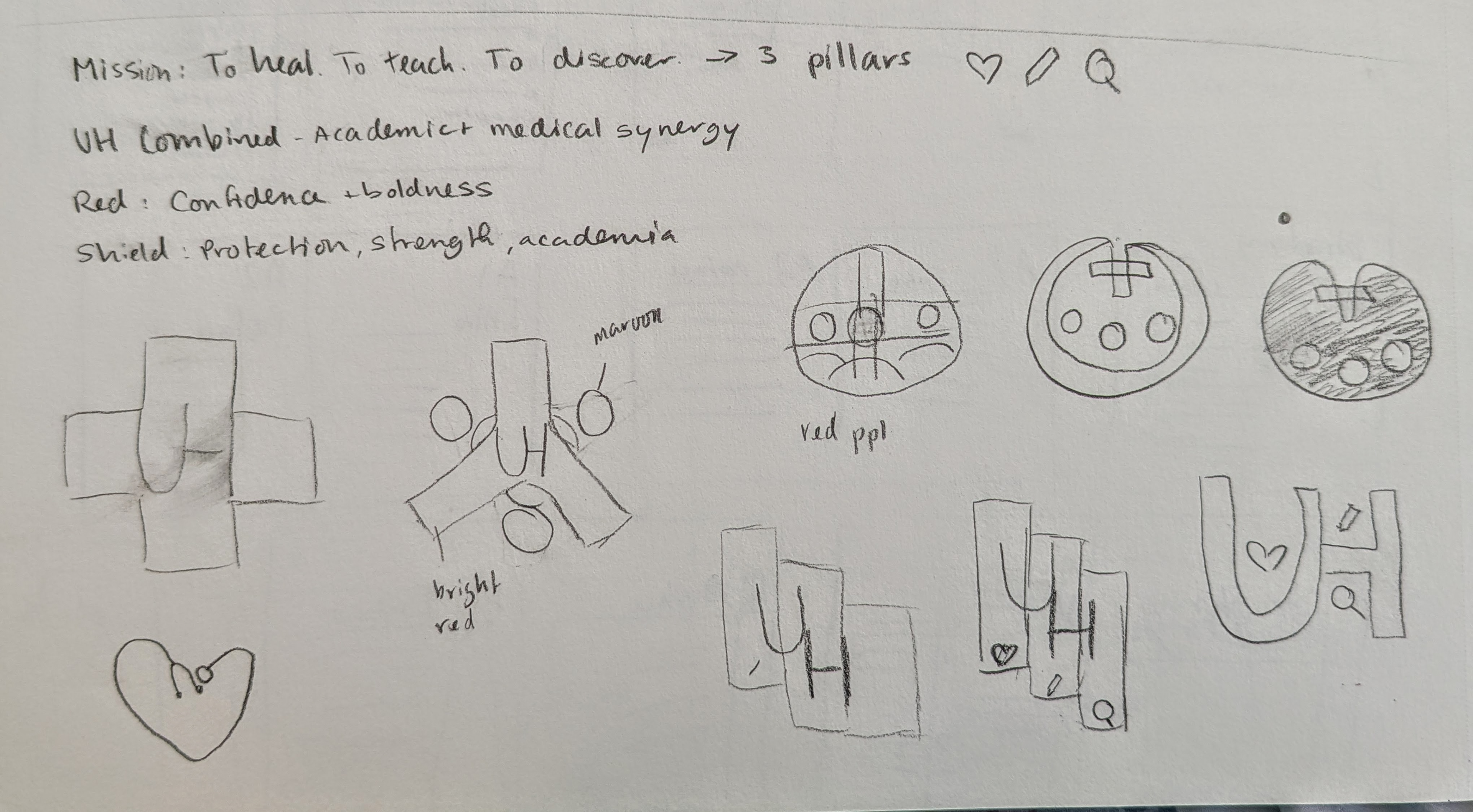


Sketches made during the creation of my mark. I initially focused on the three pillars of University hospitals, those being of healing, teaching, and discovery. Later sketches were more illustrative and focused on the empathetic care offered by University Hospitals. My final marks were all letterforms, ones that carried the sense of hospitality and professionalism.

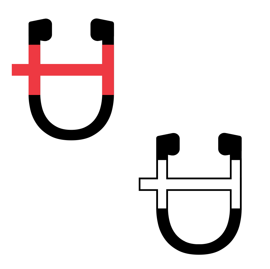
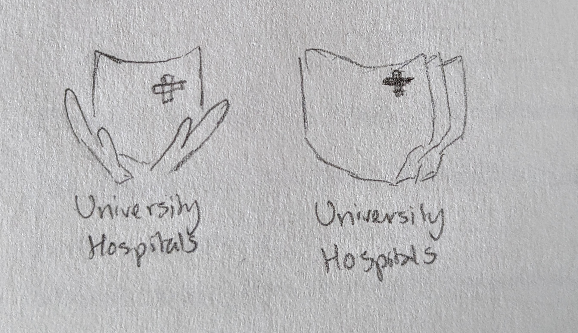
Additional final marks.

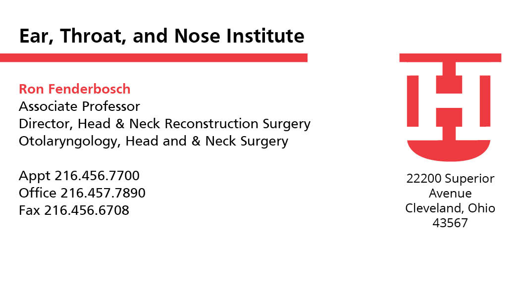
Business card integrating redesigned mark and graphic elements.
Alternate unused design.

Letterhead

First version of final letterhead design

Unused design
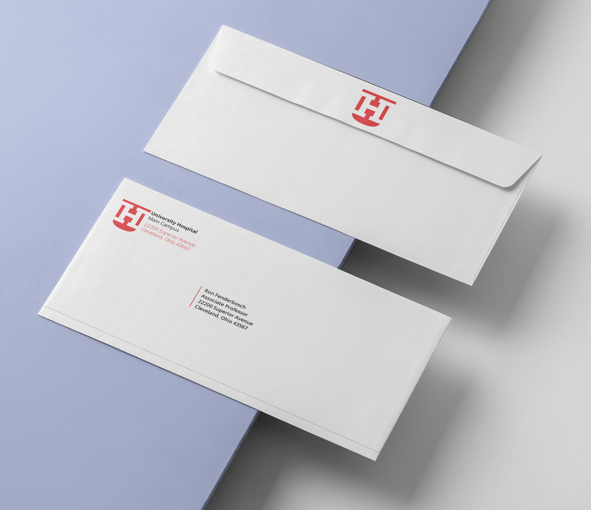
Envelope design
The final stage of this brand/mark refresh was to create a larger piece related to the design beyond simply applying the mark. Considering the brand of University Hospitals, I chose to design signage based around a pop–up vaccine clinic. The designs and planning for this event went through multiple changes, from being presented through multiple panels to involving a reception desk. The end result was a desk that welcomed visitors while posing questions about the flu that would be answered by getting a vaccine.

Vaccine reception table with common questions about the flu.


Vaccine clinic backdrop where people could receive answers to the flu questions on the reception desk.