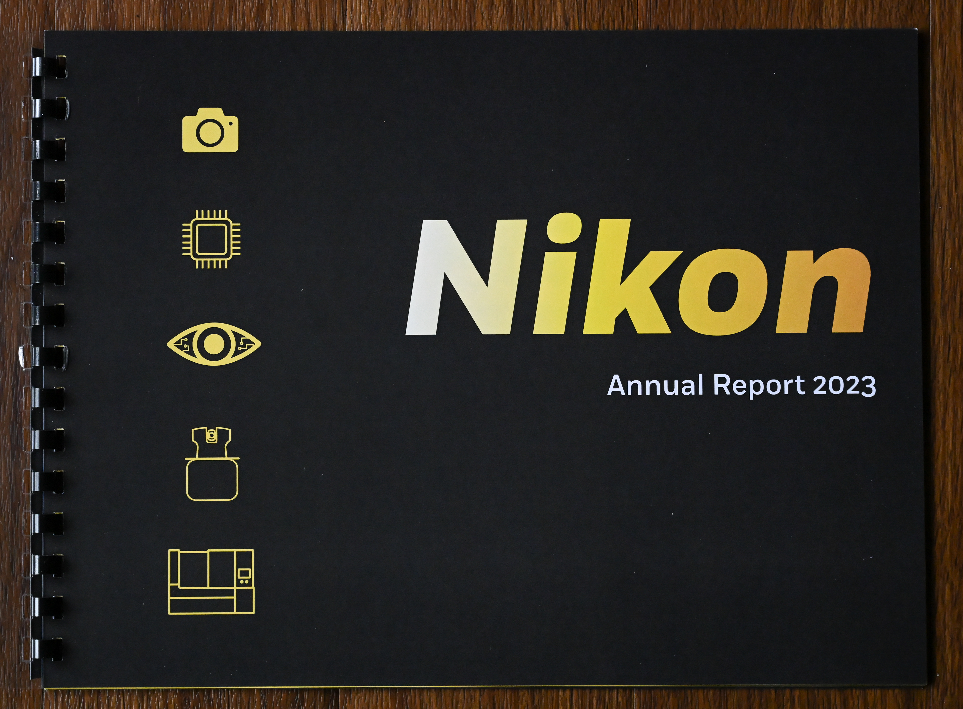
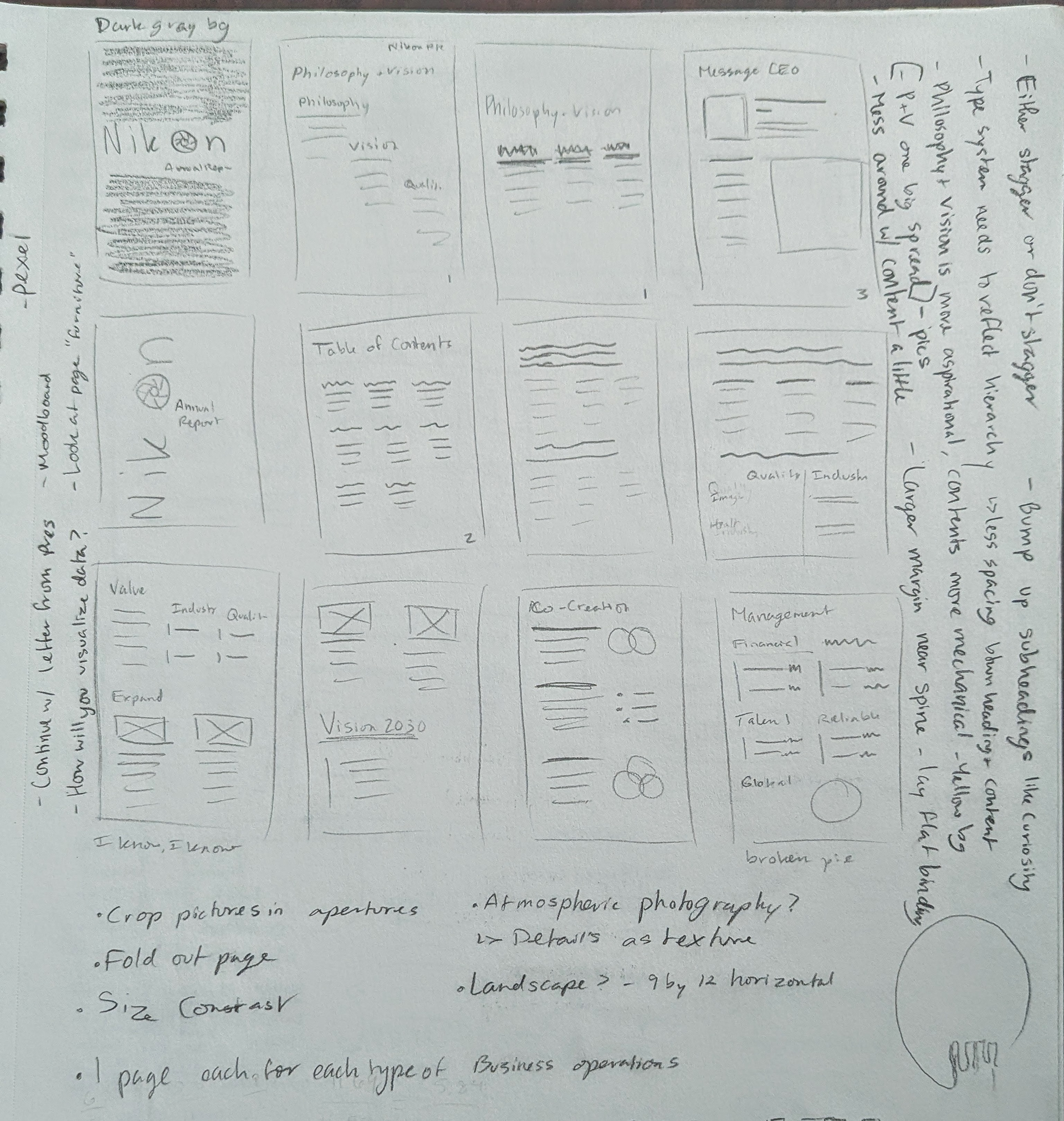
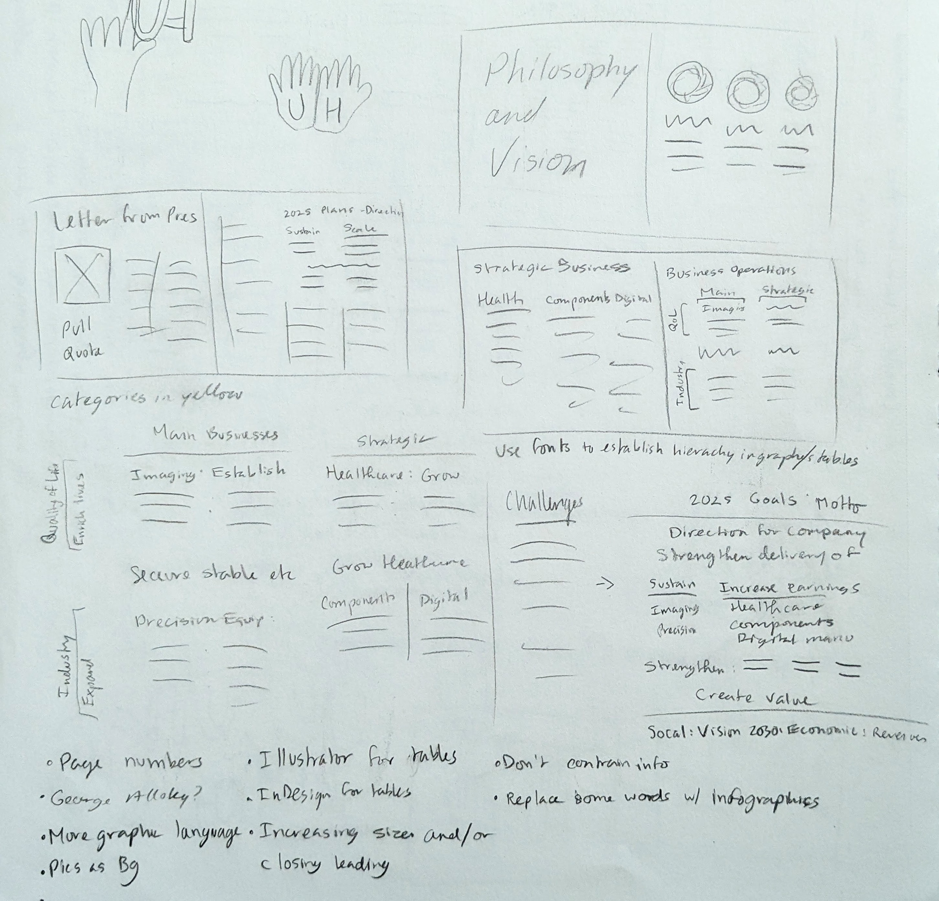
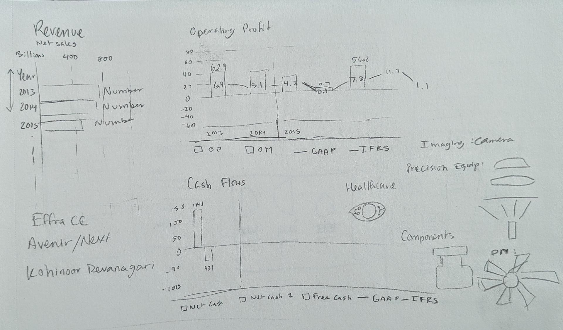
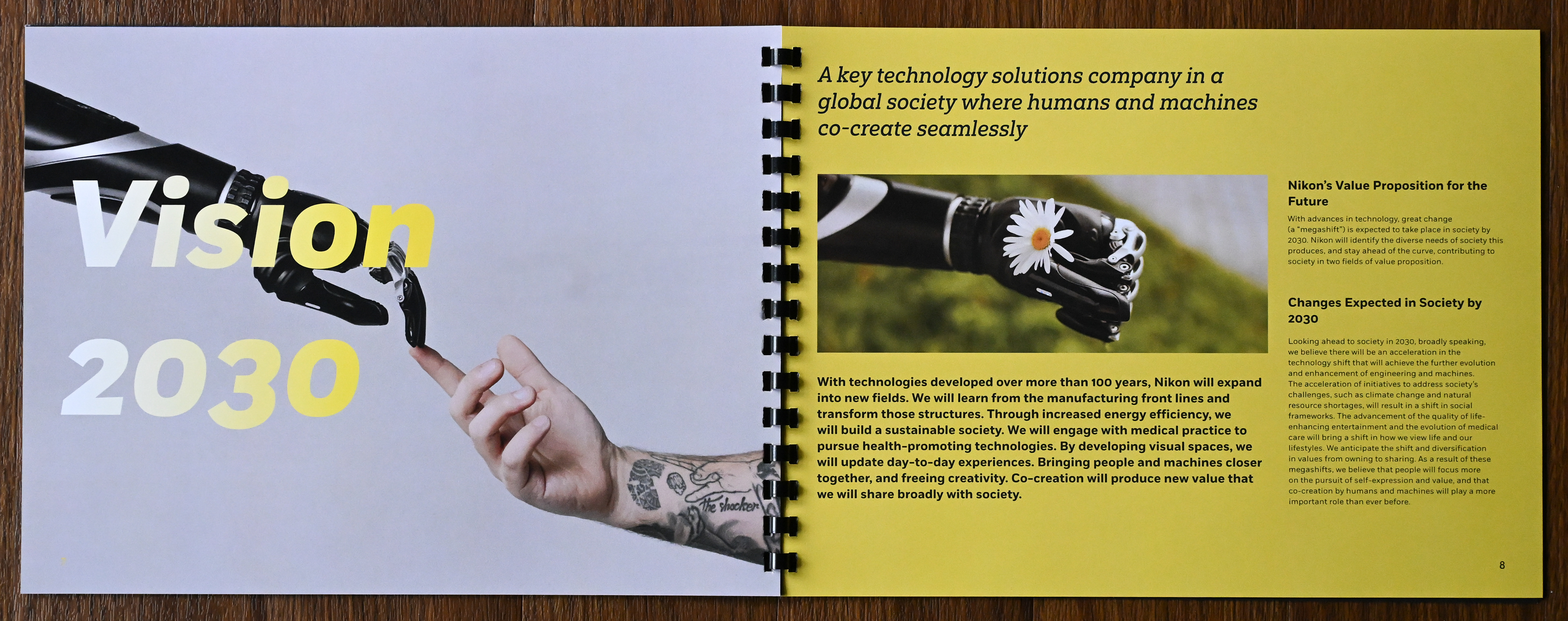
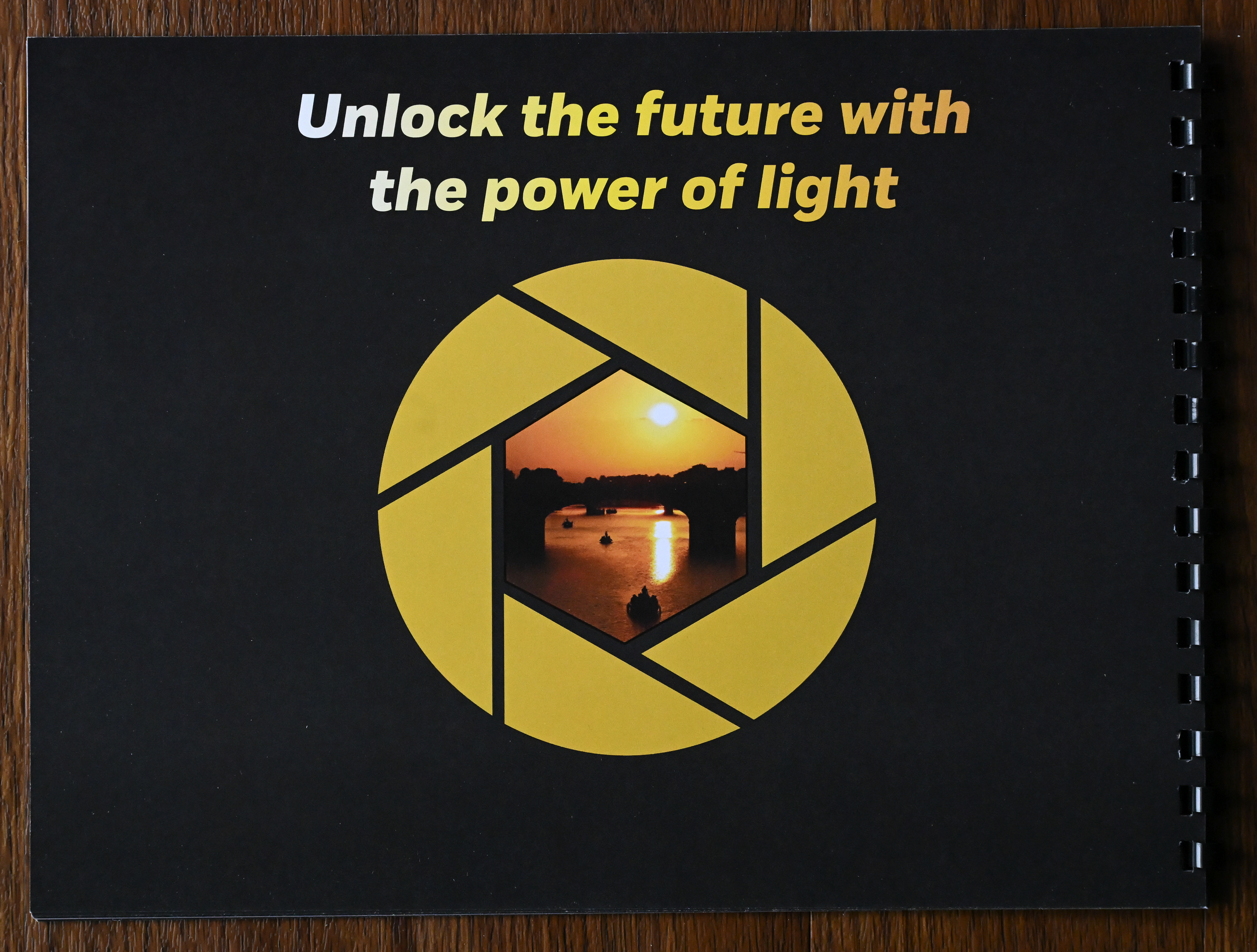
I redesigned the annual report for the Nikon company, focusing on not only their camera sector, but the other parts of their company as well. I utilized their official company colors along with adding some more to their color and typography palettes. There was an abundance of type to manage, which meant creating multiple paragraph styles and determining hierarchy, all of which took multiple rounds of feedback and iterations.
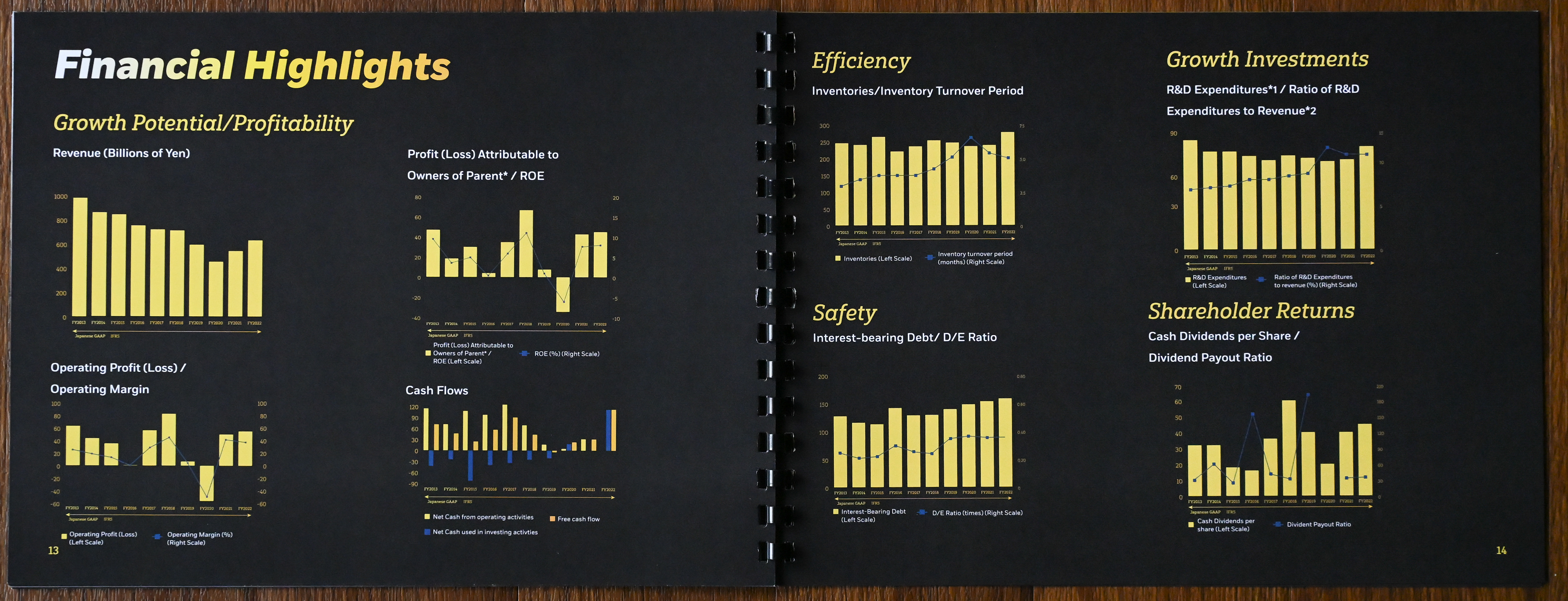
I started with a typical vertical format, but determined that my idea of a coffee table style book was more suited for a horizontal design. Most of my previous projects involving books were vertical, so this was a new direction for me. I found that the horizontal format worked well for my vision and ideas.
Progress of the various pages. Considering this was a typography heavy project, I did not initially utilize any graphics, only focusing on stylizing the type itself. Later on, I used graphics to convey certain ideas while ensuring the type remained the dominant feature.

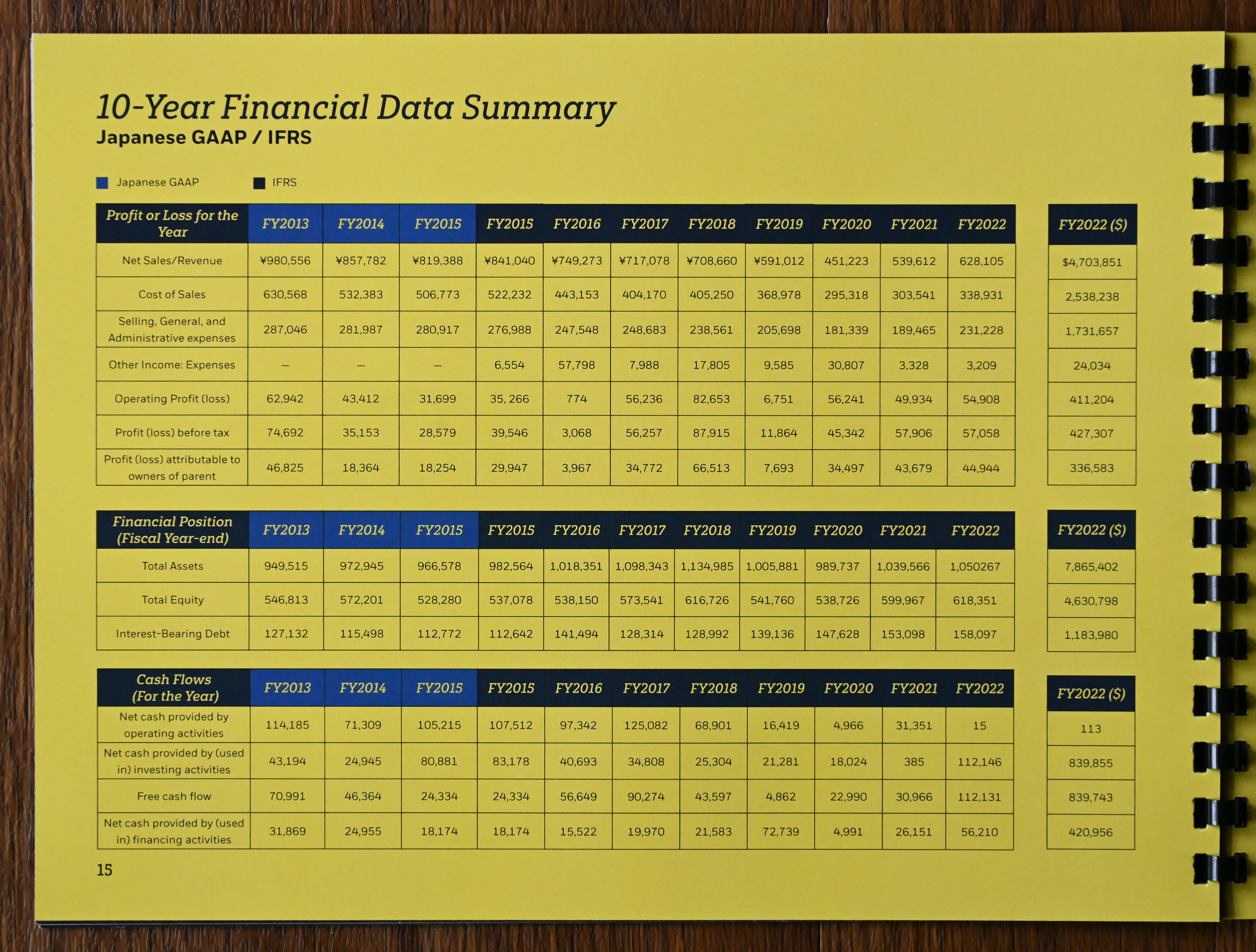
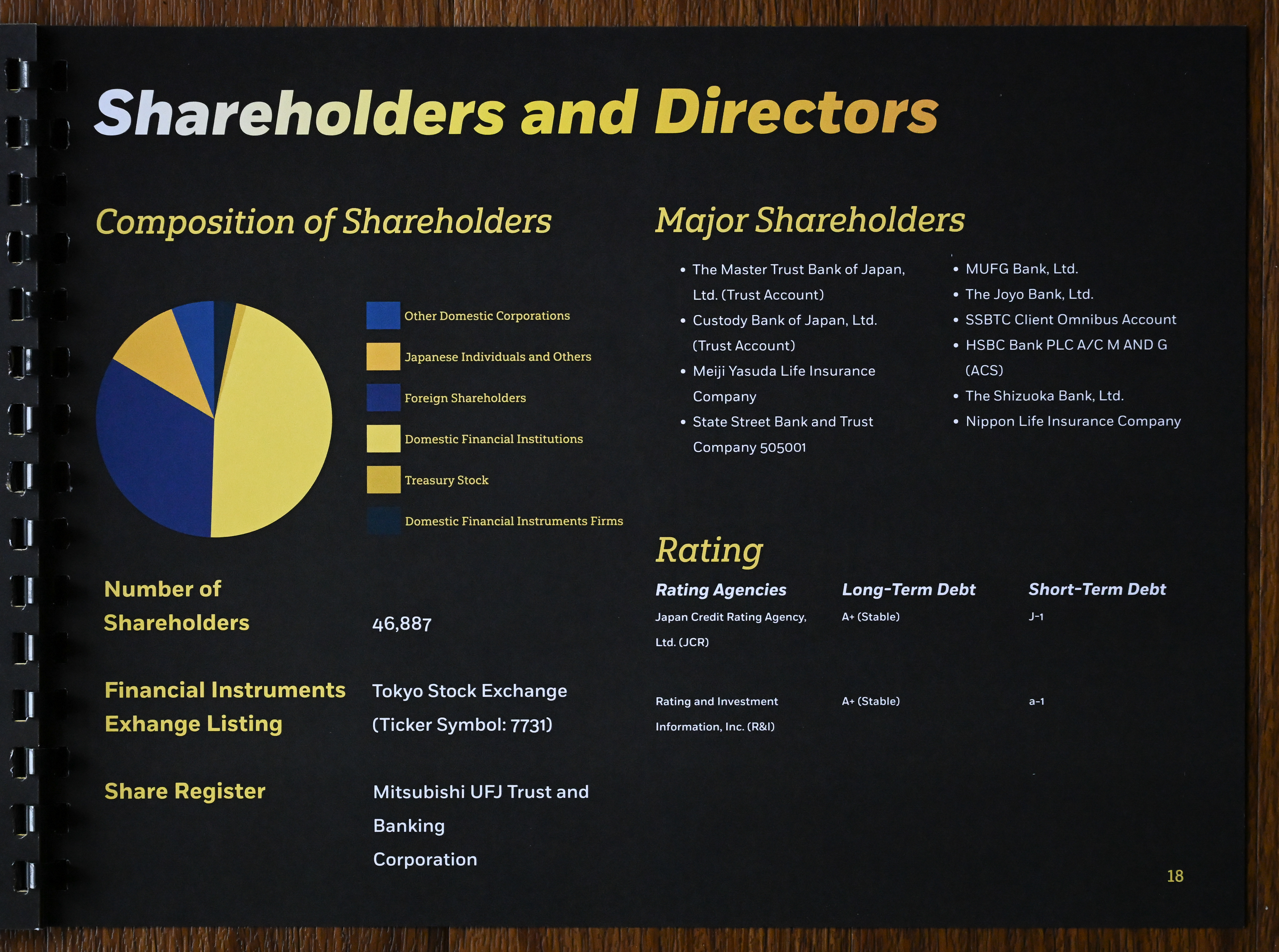
Final pages from the printed booklet. While it was a big project and involved handling macro and micro typography, I felt that it tested my skills and showed me where I could improve.