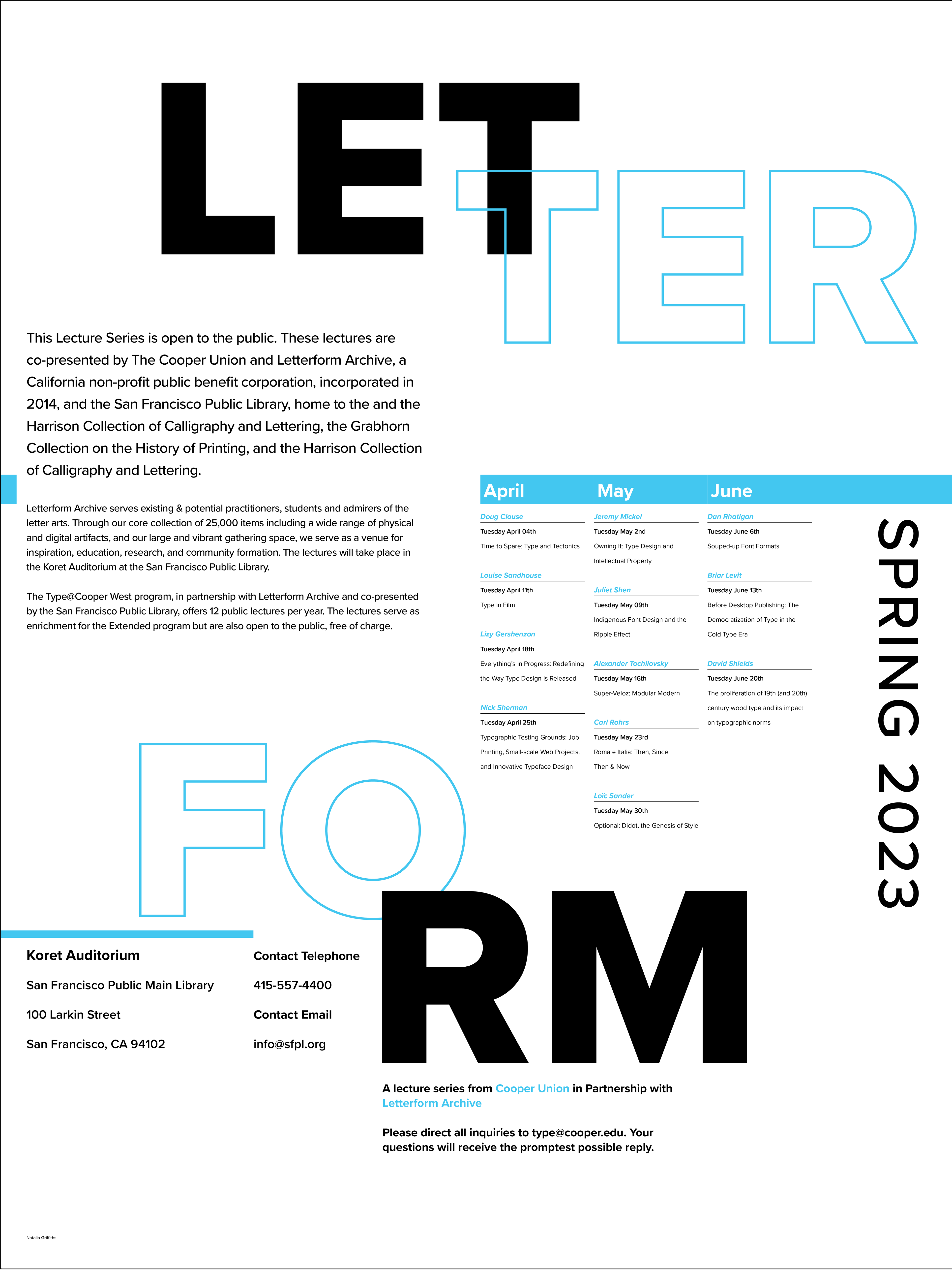
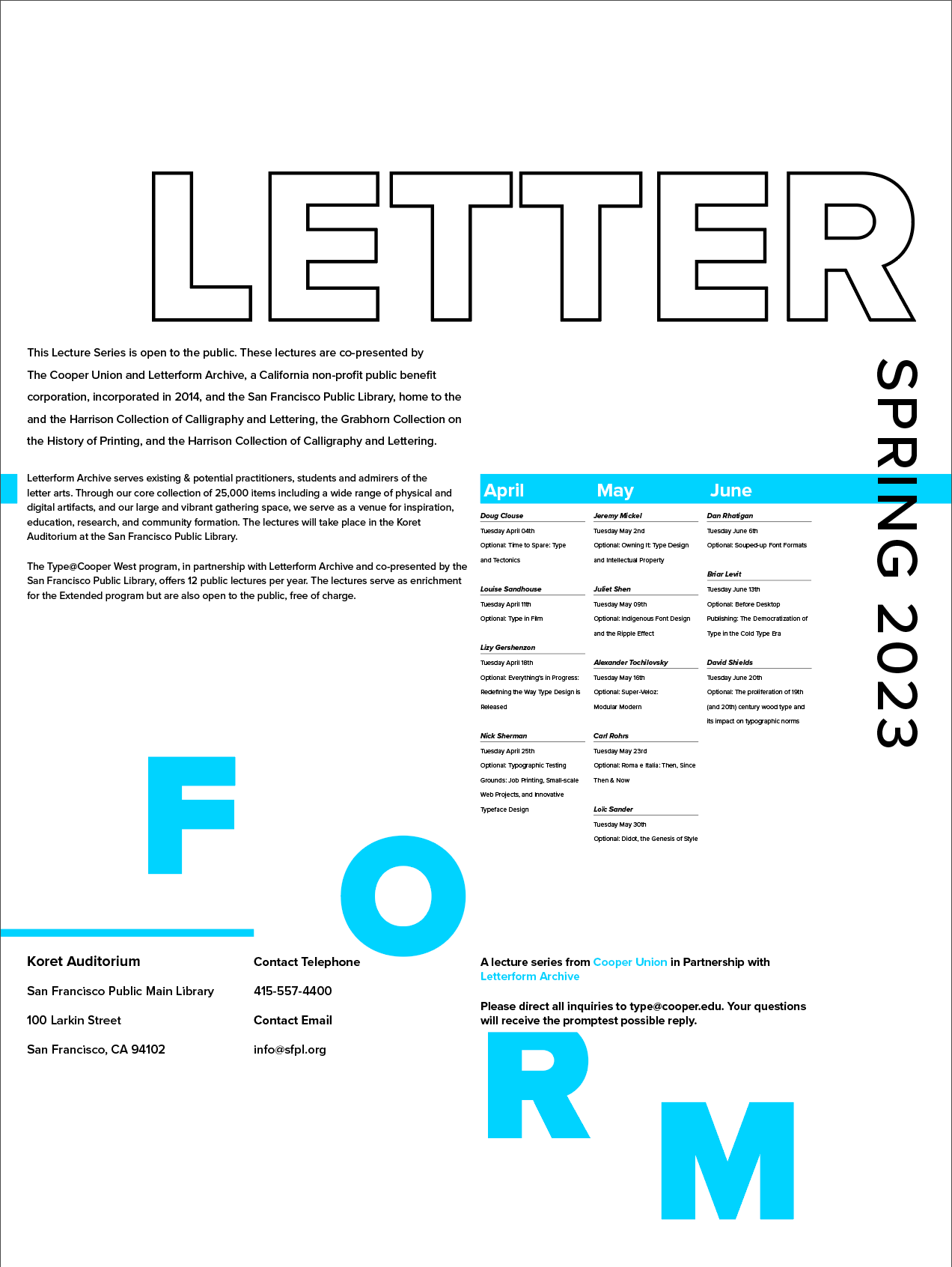
I created this poster to promote a series of typography lectures hosted by the Letterform Archive. The main objectives in creating this poster was clear organization of information, with the primary challenge being the fact that I was limited to one typeface. Learning to properly utilize multiple font weights along with size contrast made this project memorable.
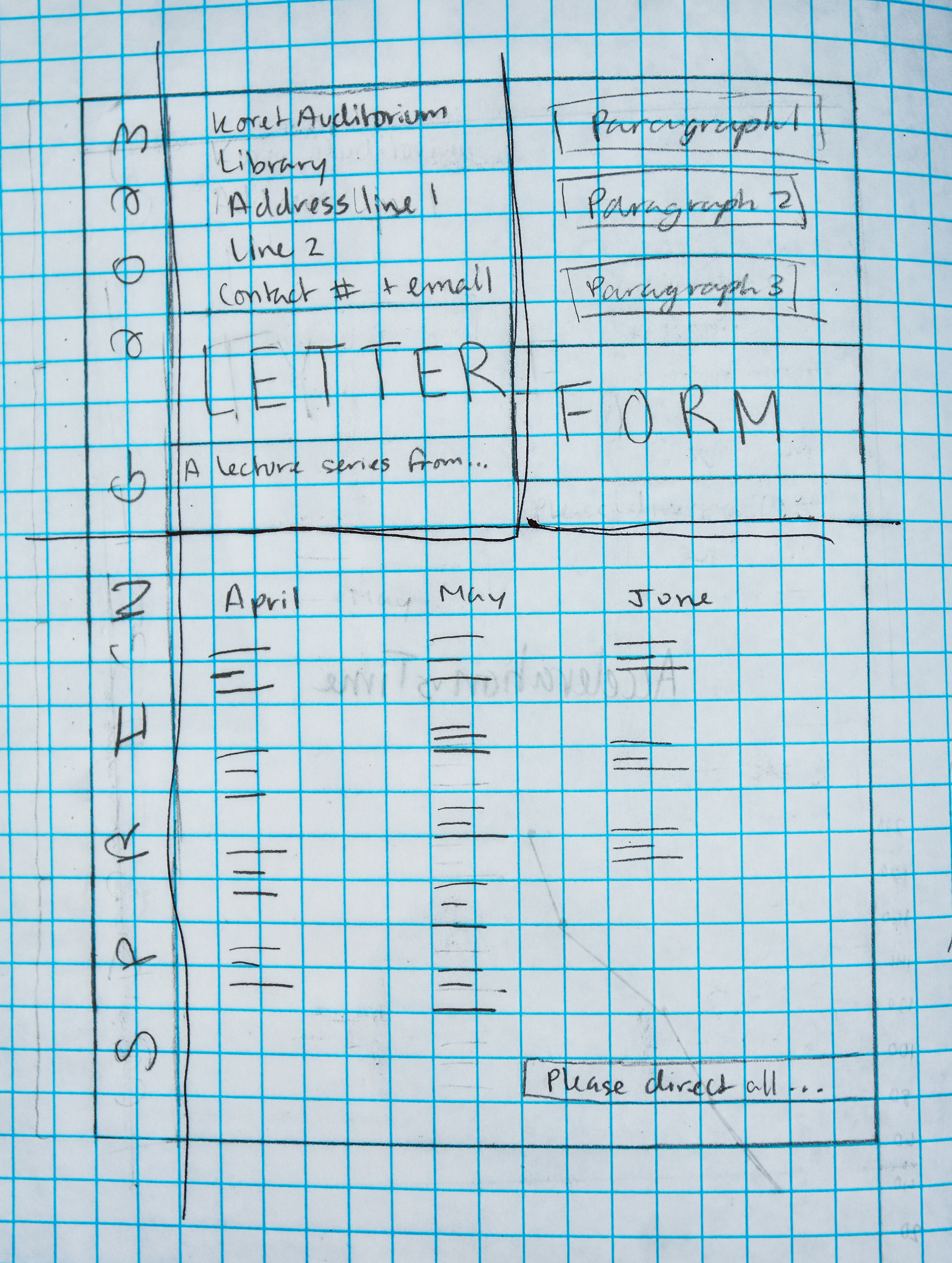
Sketches of my first ideas
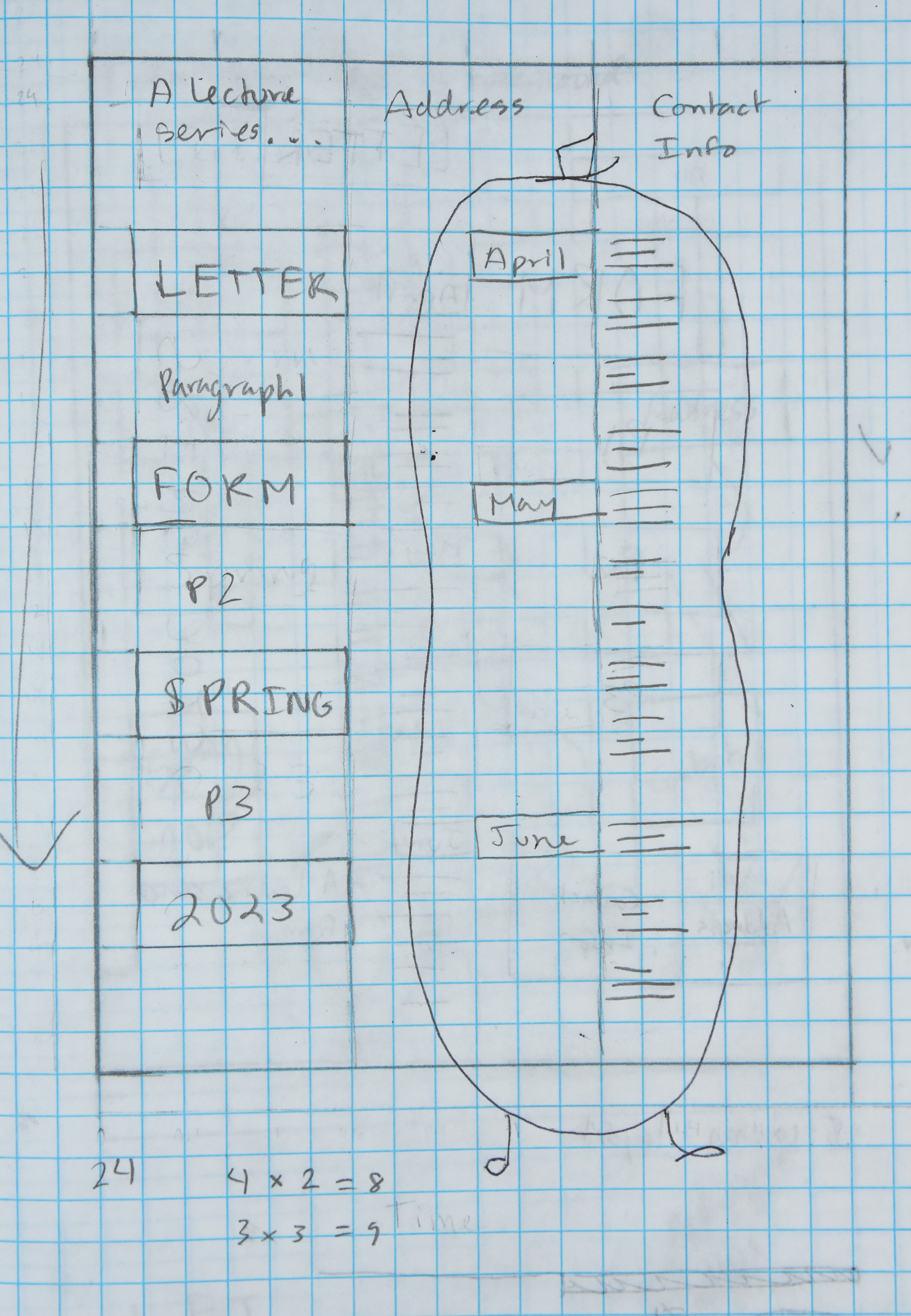
Poster iterations I made during my process. I experimented with type as image and various amounts of columns during this stage. I ultimately decided to find better ways to combine my different sizes of texts that didn't involve so much overlapping.